
I love looking at letterforms, and have a modest collection of photos of signs I’ve stumbled across that I find aesthetically pleasing. I read Brand New and the Fonts In Use blog, though, and I own a copy of The Elements of Typographic Style. But I am not a graphic designer. I don’t have the training, the practice, or the talent. I know enough to see how much I don’t know, if that makes any sense.
I’ve developed a bit of an eye, however. When Arial gets substituted for Helvetica or another typeface, I hope I catch it. When a Big Green Sign I drive by uses a typeface that’s not in the FHWA Series or isn’t Clearview, I like to think I notice. Or even smaller things, like two different R’s on a sugar packet.
Anyway, I was recently considering making a silly parody thing of the Godfather logo for one reason or another. You know, the one that looks like this:
![]()
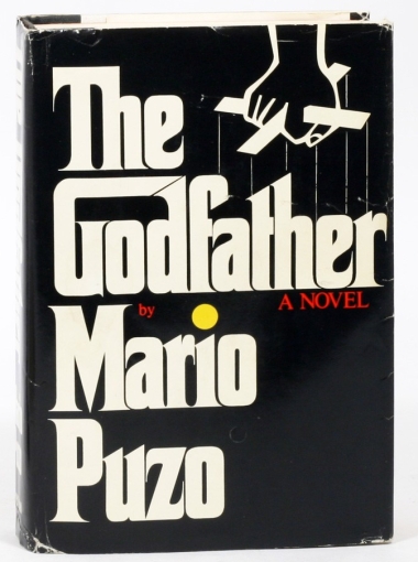
It’s an iconic design that has been “borrowed” by many many people—mainly restaurants, it seems. It was originally designed by S. Neil Fujita, a Hawaiian-born graphic designer who created, among other things, record and book covers. Let’s take a look at the original cover of The Godfather, thanks to a listing from the Manhattan Rare Book Company:
In an interview with Steven Heller, Fujita hints at one of the ideas behind the design:
I [originally] designed the book jacket for Putnam in 1969. By taking the “G” and extending it to the “D,” I created a house for “God.” The way the word was designed was part of the logo and so was the type design.
There are many nice touches in Fujita’s design. The serifs are like stilettos. The kerning is claustrophobic, with the serifs curling under the bowls of their neighbors. The T-h ligature, personally, is not my cup of tea—that left serif on the stem just seems unbalanced to me. But I do like the aligned slanted tops to the “th”, and how it is the same angle as the nearby “f”. It’s unclear whether Fujita adapted an extant typeface for this, and if he did, which he used. Fonts In Use claims a typeface called “Bellows” was the basis, but I don’t know where that came from (nor do I know if Larchmont existed, what it looked like, or if it was a clone of Fujita’s version).
I expect that many of you know where I’m going with this, so I’ll cut the games. Let’s look at the original book cover (the “Original” version) juxtaposed with the first image I swiped from Google Images (the “Random Internet” version):

Something obviously got lost when someone digitized the logo for the Random Internet version. There’s more breathing room between the letters; the “house for God” has a skylight; the serifs are more triangular and generally only on the right side of the stem; and some of the letters are just plain different, like the e and r.1 I’m not sure why the Random Internet version is so—angular, I guess? I doubt I’m seeing all the differences, or that I’m articulating the changes in the best way, but they’re different.
But is the Random Internet version is unofficial? Or has the logotype changed over the years? I got curious. I am admittedly not a super-fan of the book or movies—I’ve only seen the first film, and have never read the books. I certainly don’t have access to any archival material or primary sources. But I do have the Internet, which is pretty good, so let’s give it a whirl.
The Godfather was published in 1969. Along with the hardcover edition, published by G.P. Putnam’s Sons, there looks to have been a softcover edition from Fawcett Crest.2 The temporal proximity did not mean the logotypes were identical:


Three things stick out about the first paperback edition (the “Fawcett” version), above on the right. First, overall, the longest serifs are all less prickly; the serifs on the bar of the T, off the terminal of the r, and on the finial of the e are no longer the needles they were in the Original version. This “defanged” trend will become standard. Second, the Fawcett version seems to have the first chronological instance of what I’ll call the “skylight,” referring to the open “roof” between the G and d.3 The Fawcett version also removes the T-h ligature, separating the first two letters of the title. Some aspects of the Original version remain, however—the imbalanced serifs on the foot of the T and the tighter letterspacing as compared to the movie title.
Three years later, the first movie came out, employing Fujita’s design for the titles (all movie title stills come from the Movie Titles Stills Collection):
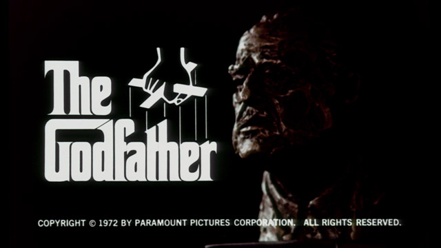
The logo in the trailer is very close to the Original version. Some of the thinnest serifs are again lost, defanged as in the Fawcett version, and some of the hairline spaces between letters have disappeared (f-a and t-h). It’s certainly possible that the letterforms were redrawn to remove these fine hairline serifs. I’m not particularly familiar with how such the book cover design would have been transferred to film in the early ’70s, but I imagine that the loss of the fine detail could also be a ramification of the process. Maybe the film stock was cheaper, or the titles were overexposed during the optical printing process, or the original title used was just roughly copied. Aside from the loss of detail, though, the trailer title is essentially the same as the Original version. Also extremely close—if not exactly the same—is the version used in the poster for The Godfather:

Everything seems to line up well—even the serifs are needly. How about the actual movie?
For the first movie (the “First Movie” version), the title card sticks to Fujita’s original design. Again, the serifs have been defanged. There seem to be a few other minor changes, which I will highlight.

- For the Original version, the serifs on the foot of the T were asymmetrical. The larger left one, circled in yellow, has been redrawn smaller to match the right foot. I am guessing that this has to do with the fact that the book’s words were stacked and the movie’s were inline—a shorter left serif on the foot of the T on the book would look misaligned with the G in Godfather unless you shifted the whole word left, but that would mess up the alignment with the end of the arm of the T.
- There looks to be more space between the G and d in the roof of the house of God, as called out by the orange quadrilateral. Generally speaking I think there’s more space between letters—look at the space between the t and h, outlined in pink.
- The hands and marionette control bar have been redrawn. The clearest area of this (to me) is the knuckle in the hand, circled in red.
- The marionette strings meet some of the letters in different places, as indicated by the green arrows.
- In the Original version, the short stem (which I want to call a leg, but is apparently not) meets the baseline with a serif on the right and a right angle on the left, as seen boxed in blue. In the First Movie version, the right angle becomes a swashy curve, following the serif on the neighboring stem and looking slightly calligraphic.
The publishers were also busy while Francis Ford Coppola and Marlon Brando were hard at work.


It seems four relevant books were released between The Godfather in 1972 and The Godfather II in 1974. Three paperback editions of The Godfather were released. The middle one (in red) was published in conjunction with the movie and, it seems, the left one (in white) was published. in conjunction with its broadcasting on television. The paperback editions here are, as far as I can tell, identical to the Fawcett version, which would make sense, as they were also published by Fawcett, and may have used existing assets.
Pan Books apparently had the publishing rights to The Godfather in the U.K., and theirs came out in 1972. It, at right (in black), is close to the Original version. It’s hard to tell from a smallish JPG, but it looks like the serifs are defanged again, and perhaps the left serif on the foot of the T is a little smaller. The most interesting thing that clearly can be seen is the change in “Mario Puzo”:
The M has a chopped vertex, the bowl of the P is slanted, and the corners of the z are no longer pointed. Puzo also wrote The Godfather Papers in 1972, which apparently detailed his experience writing the book:

The cover of The Godfather Papers is, along with the movie poster version, the closest yet to the Original version. It hasn’t been “defanged” (i.e. the serifs are still needle-like), the spacing seems right, the T-h ligature is still there, the roof is closed up tight, etc. The most interesting thing is the extension of the stylistic alphabet to include new letters—namely, the lowercase p and s in “papers.” This is the second such extension—the first being the introduction of ARIO UZO in the First Movie version (Mario Puzo’s name was only in mixed case until that point).4
It wasn’t just books that accompanied the movie, however. Paramount put the soundtrack out on vinyl as well. The sleeve and the records all had the logo:


The positioning of the strings points these as both being based on the Original version, not the First Movie version. The sleeve, which I assume was able to be printed more precisely, shows the fine serifs and other characteristics of the Original version, too.
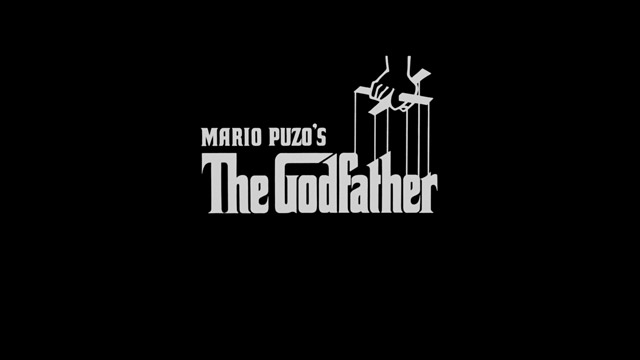
Next in the series came The Godfather Part II in 1974:
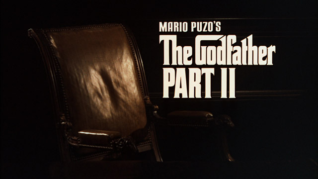
This Second Movie version is very close to the First Movie version:

I’d go so far as to say “The Godfather” is the same. However, it looks as if Mario Puzo’s name has been redrawn. It’s most noticeable in the A, Z, and S, as well as the apostrophe. The words “PART II” are, of course, new. Note that the A in Mario is different than the A in PART. The P and R have also been redrawn, but that’s not surprising given the different sizes of the two.
Perhaps more interesting, however, is the theatrical poster for The Godfather Part II:
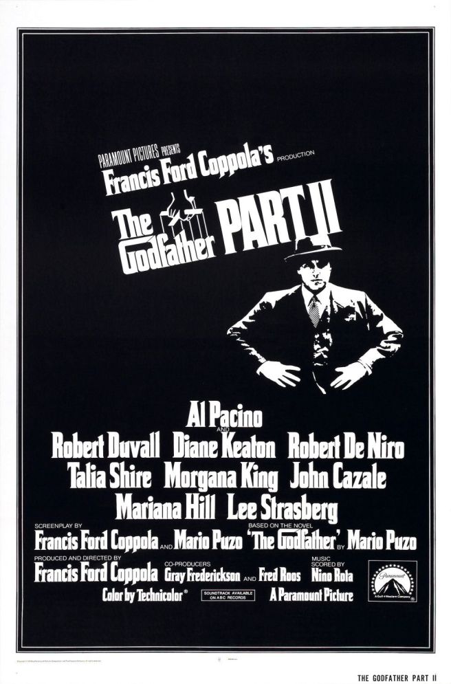
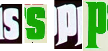
Wow. Two things about this stand out. First, forget about the few added letters to the character set from The Godfather Papers or PART II. Here we have a vast collection of new letters for the typeface. The p and s in the poster are different from the p and s in The Godfather Papers:
Aside from the explosion in letterforms, the other interesting thing about The Godfather Part II poster is that the main logo is a slanted version of the Original version, not the First or Second Film version! The most obvious ways to tell are the feet of the h’s, the knuckle of the hand, and the places where the marionette strings intersect the words. The posters associated with the first two movies are both the Original version, even though the titles in the movies themselves are their own thing.
In 1977, NBC aired a recut combination of the first two movies (then, of course, the only two movies) now known as The Godfather Saga. The version used in the title there seems to be the movie version with an added phrase:


I couldn’t find the title from the original airing, but YouTube has the opening of the 1980 rebroadcast. YouTube also has a introduction to the movie from the 1977 broadcasting done by actress Talia Shire that includes a logo over her shoulder. In both cases, it looks as if the logo used is one of the two movie versions based on the position of the strings (it’s too grainy to tell which). In a weird connection, the typeface used for the subtitle really looks like the one used for the Haunted Mansion.5
In 1981, this cut—The Godfather Saga—was released on home video as The Godfather 1902–1959: The Complete Epic. The case cover and the accompanying book both used the stacked Original logo, but the cassettes themselves had an inline version (“The” and “Godfather” on the same level) with a smallish “The”:


Also note the different fonts for the subtitle—the book is the odd one out here, with a condensed bold Cheltenham and the tapes and case using some sans serif I can’t identify.
As far as I can tell, the next interesting events in the franchise were the publication of Mario Puzo’s next books, Fools Die in 1978 and The Sicilian in 1984. The covers of these books bear some resemblance to Fujita’s design for The Godfather (especially Fools Die):


Fools Die even uses the differently-colored tittle on the i in Mario that Fujita used in The Godfather, only blue instead of yellow. The letterforms are bigger and bolder, however—and more squashed. The Sicilian branches firmly off in a different direction, although some of the letters still are clearly influenced by The Godfather‘s styling. When these books came out, Signet, who was then publishing the paperback editions of The Godfather, updated the covers to reflect the new titles:


It’s hard to tell, but these seem to hew pretty close to the Original version.
So as the 1980s came to an end, it looks like there were a few versions of the logotype running around already. There was the Original version, the Movie versions (which only differed with in how MARIO PUZO’S looked), and the Fawcett version used on the paperbacks in the 1970s. There were a few instances where characters not in the original set of “The Godfather Mario Puzo” were needed. The most complete example looks to have been The Godfather Part II poster.6 Different attempts yielded different letterforms, however, as evidenced by The Godfather Papers and the Pan Books edition.
In 1990, however, The Godfather would come back into the popular consciousness thanks to the third movie in the series. In the next part, I’ll take a look at what happened next.
Footnotes
- It’s not all bad. I think the Random Internet version resolves the conflict between the crossbar of the f and the a better, although it squanders that victory with the odd t-h collision. ⤴
- As an aside, the UK first edition, also from 1969, seems to have had a very different and less-inspiring cover. ⤴
- Interestingly, the skylight of the Fawcett version is larger than the skylight of the Random Internet version. ⤴
- The “s” looks odd to me. But that’s just my opinion. As, I guess, most of this is.⤴
- Someone has digitized this typeface, calling it Ravenscroft. David Occhino has a separate version called Mansion. Despite what the Internet says, the typeface is not related to anything Peter Paul Rubens designed, but is based on a typeface called Rubens. I don’t seem to be the first to have noticed this connection. ⤴
- In case you were wondering, I briefly looked into foreign movie posters. Conveniently, the title of the movie in many foreign languages didn’t require any new characters—il Padrino, for instance, in Italy, only needed an “n” and an “l” (the P having been in Puzo), as did el Parrain in France. The Godfather Part II needed a few new ones too—PARTIE II in French is 2e PARTIE, requiring an “I” and an “E”. I felt the need to cut myself off at some point, however. ⤴

Hi, thank you for this hyper-detailed history of The Godfather’s logotype!
Do you think the font for Fugee’s album “The Score” (1996) was inspired as well by the G’s logo?
Many thanks 🙏
LikeLike
Thanks! No doubt re: The Score in my mind. What’s really interesting about it is that The Score’s cover was clearly _designed_. That’s not a free font—the “s” doesn’t match Corleone, for instance, and the “Th” is different from all the other iterations. Clearly it was someone who was trying to extend a design motif and create something for this different context without having access to any of the preexisting material. It ended up much better than the free fonts (and I’d say than some of the “official” versions).
LikeLike